Ames Downtown is a modular, typography-led identity system inspired by local architecture, brick textures, and iconic bike racks capturing the city’s movement, heritage, and vibrant community spirit.
VISUAL LANGUAGE
dESIGN APPROACH
03
02
Quater arch:
Movement & continuity
This element references the curved silhouette of Ames’ iconic bike stands and architectural canopies. It represents forward momentum and serves as a recurring corner or framing detail in layouts.
Vertical lines:
Structure & stability
Echoing the tall windows and vertical siding of historic Ames buildings, this motif adds a sense of order and rhythm. It acts as a visual anchor in compositions or as a texture in print/digital applications.
Wavy forms; Energy & vibrancy
Inspired by artistic expressions and the dynamic local culture, these waves suggest creativity, movement, and fluidity. They bring a youthful, upbeat energy to the system.
Circle grid: Community & connectivity
This cluster of dots represents people, gathering, and interaction. Its regular grid mimics brickwork and community organization, reinforcing the human-scaled charm of downtown Ames.
This concentric design nods to architectural archways symbolising layered history and a culture that reverberates through time.
Radiating arches:
Heritage&
resonance
Brick blocks: Texture & Tradition
Inspired by brick facades , this icon reflects the town’s textured architectural legacy and the enduring craftsmanship embedded in its buildings symbolizing a deep connection to place and heritage.
04
05
06
07
08
09
10
LOGO CONSTRUCTION
LOGO
LOGO
COLOR PALLETE
USAGE GUIDELINES
VISUAL IDENTITY
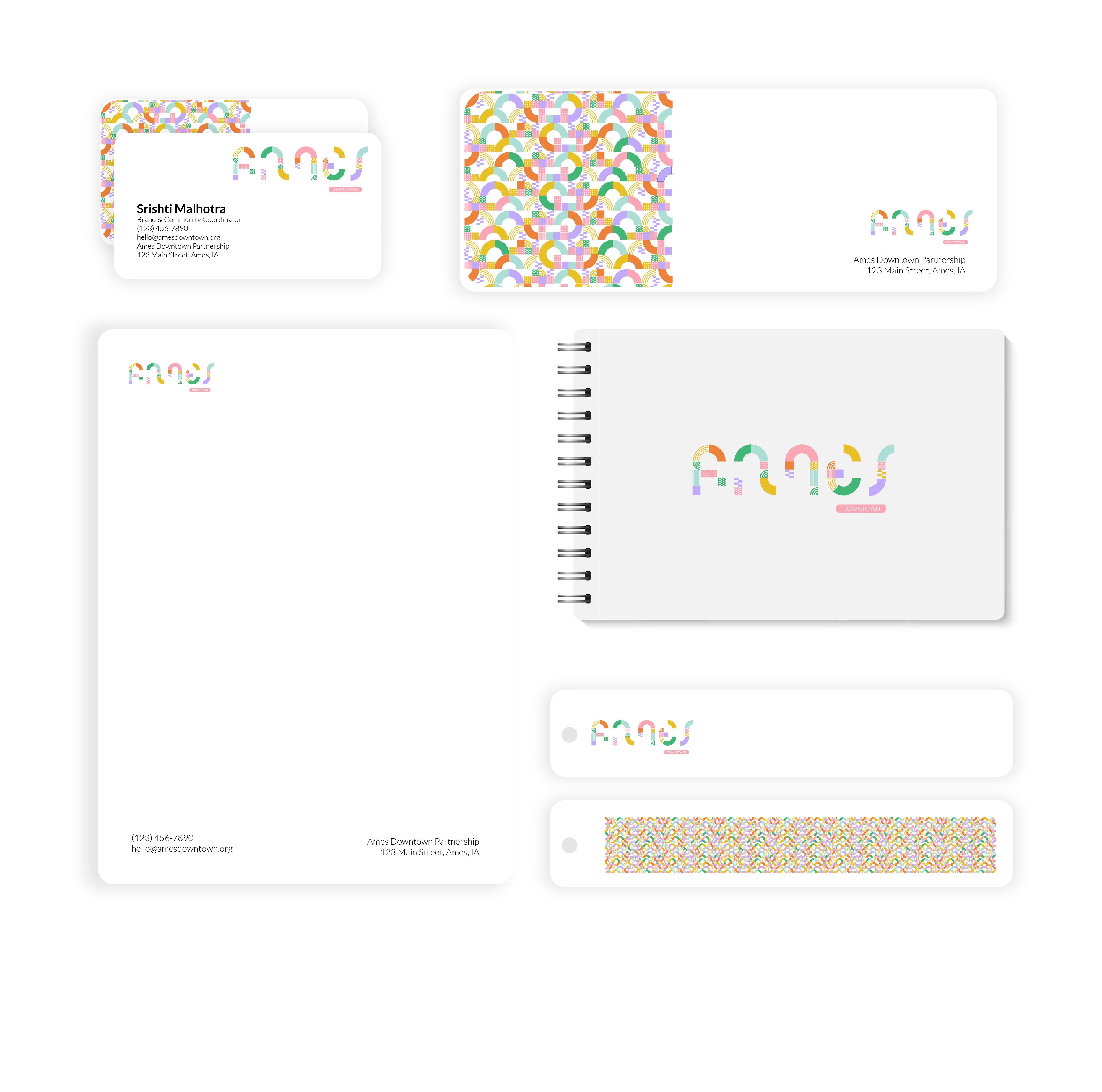
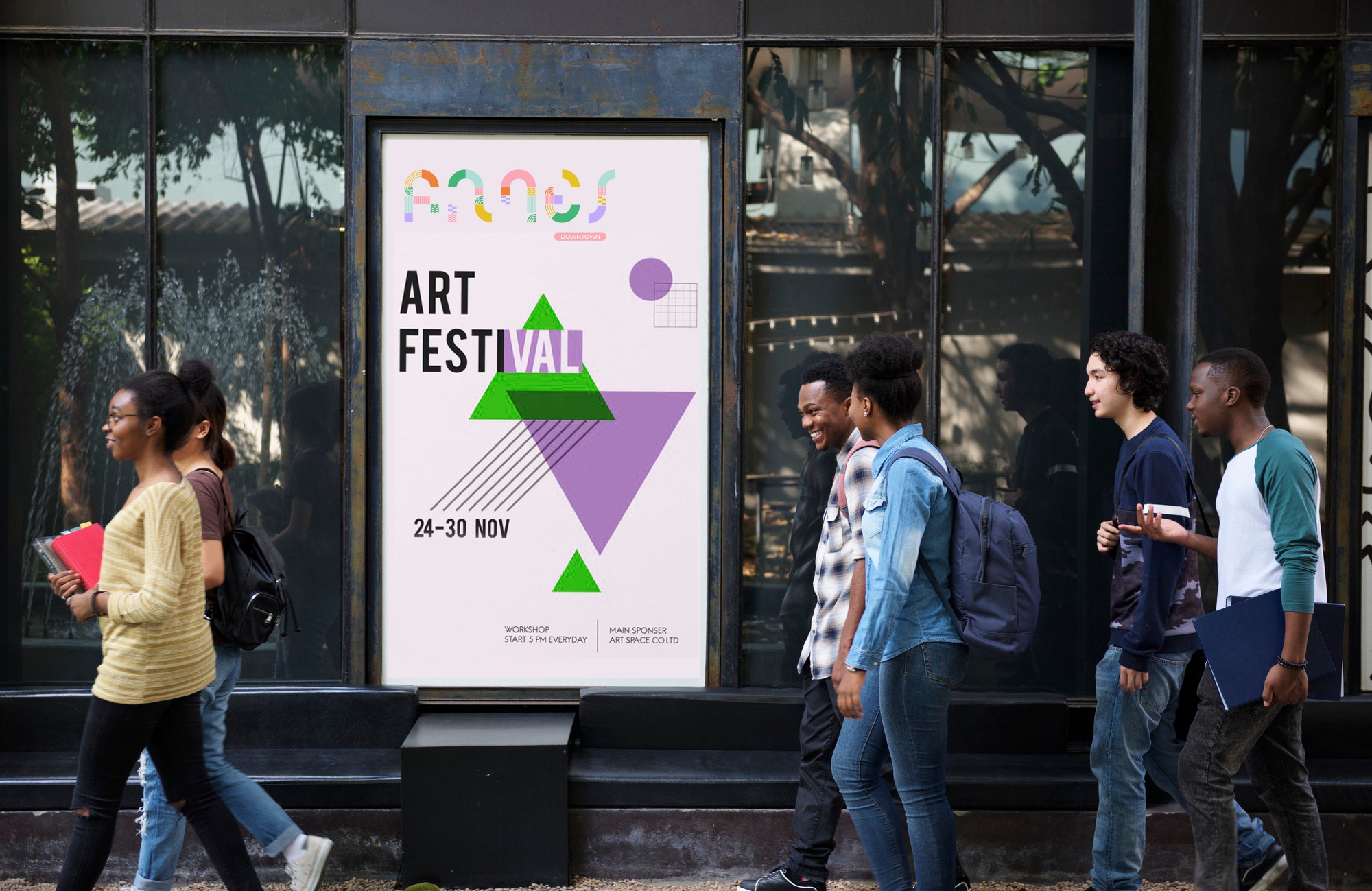
VISUAL APPLICATION

Tools
Designer
Srishti Malhotra
Project
Ames Downtown
Custom Typeface & Brand Identity System





Design Framework
01
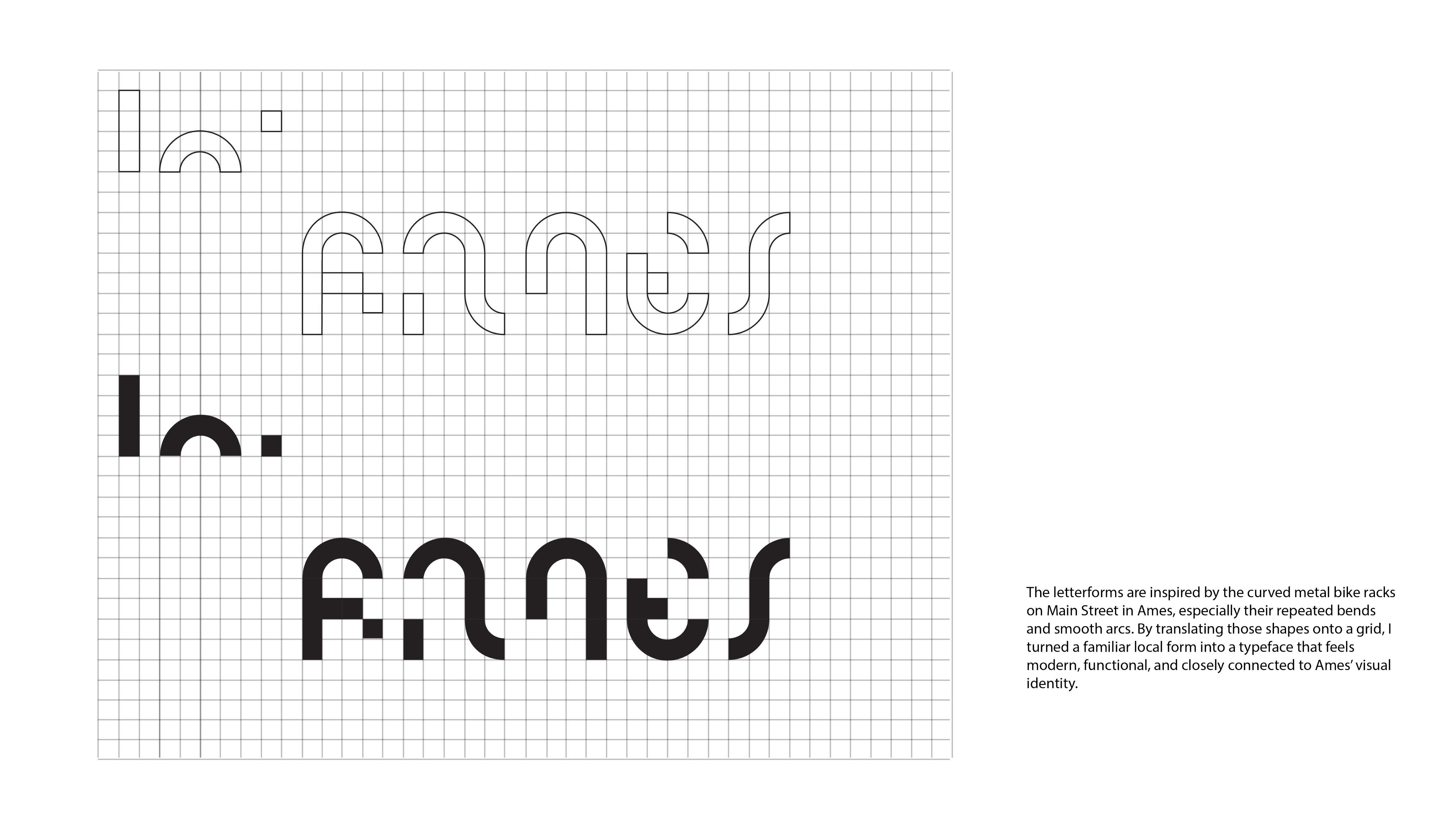
The redesign draws inspiration from everyday elements of Downtown Ames, especially the curved bike stands that suggest movement and flow. Combined with patterns from brick facades and storefront details, these forms shaped a modular identity that reflects community, history, and forward momentum
Primary typography
Secondary typography
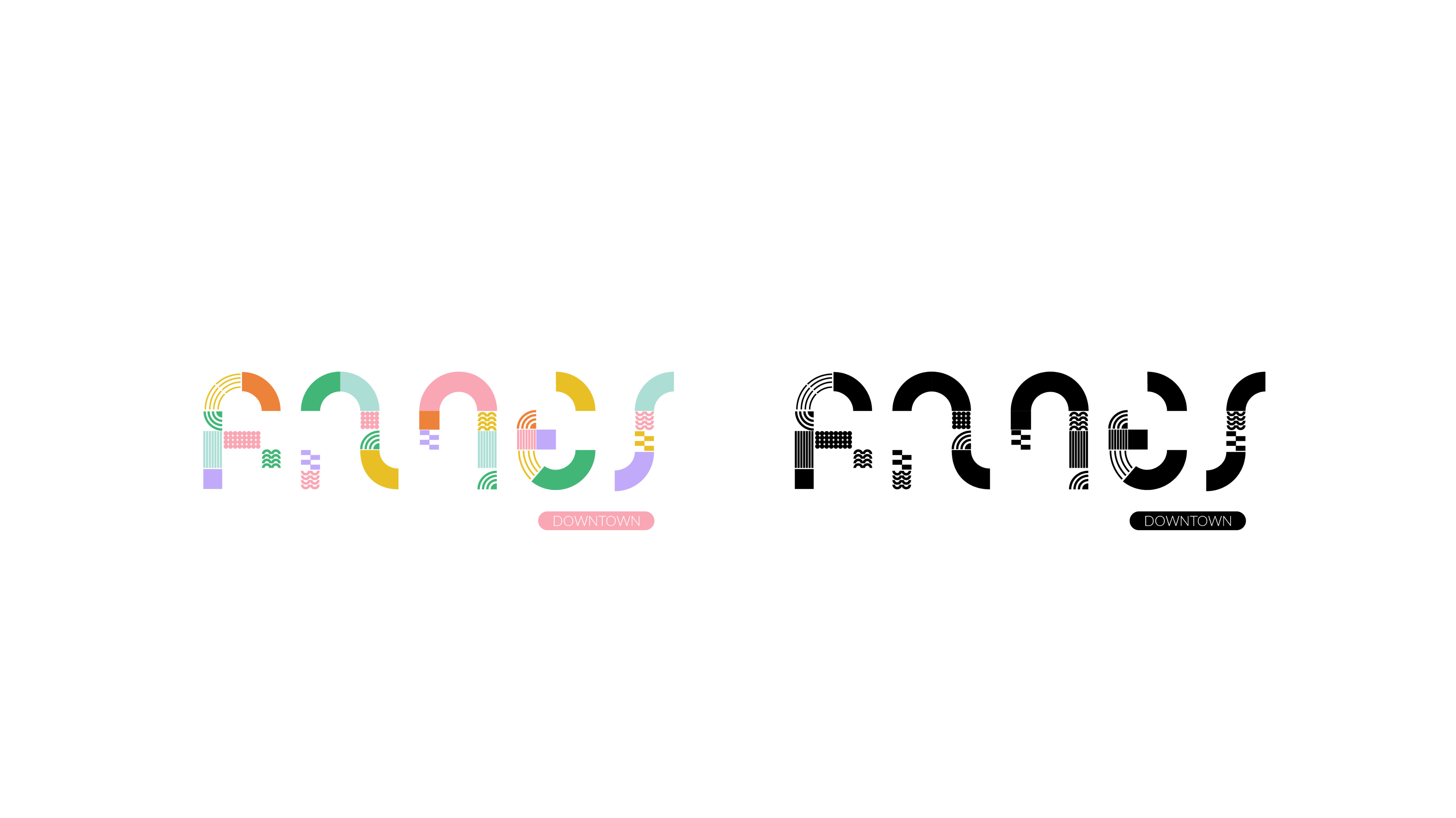
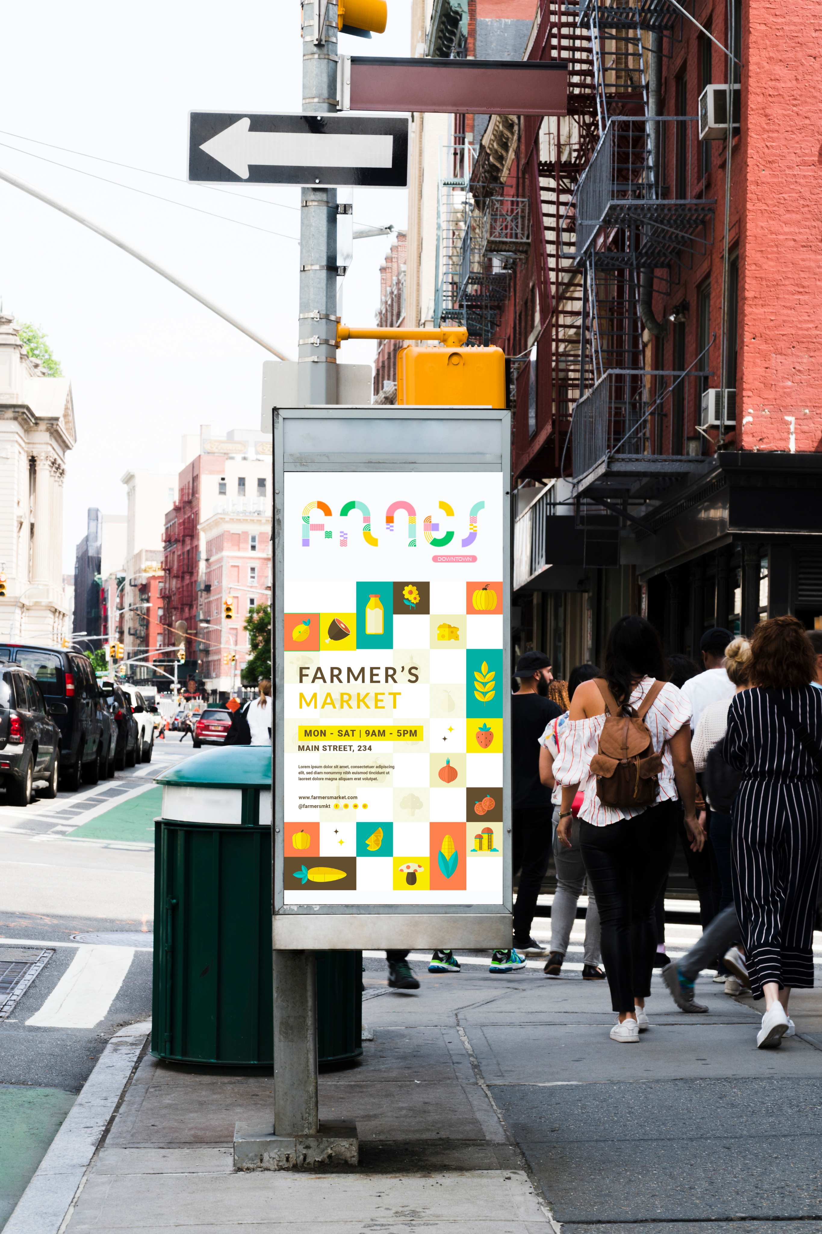
The new Ames Downtown logo blends the custom Loopline typeface with modular patterns and soft, vibrant colors drawing from local architecture and textures. It captures the essence of a community that’s rooted in heritage yet full of movement, creativity, and warmth.


LATO BOLD
LATO LIGHT
LATO REGULAR
ABCDEFGHIJKLMNOPQRSTUVWXYZ
abcdefghijklmnopqrstuvwxyz
0123456789$%&(.,;:!?)
ABCDEFGHIJKLMNOPQRSTUVWXYZ
abcdefghijklmnopqrstuvwxyz
0123456789$%&(.,;:!?)
ABCDEFGHIJKLMNOPQRSTUVWXYZ
abcdefghijklmnopqrstuvwxyz
0123456789$%&(.,;:!?)




HEX: df874a
RGB: 223, 135, 74
CMYK: 10, 55, 80, 0
HEX: 64b47c
RGB: 100, 180, 124
CMYK: 63, 7, 67, 0
HEX: 000000
RGB: 0,0,0
CMYK: 0,0,0, 100
HEX: ffffff
RGB: 255, 255, 255
CMYK: 0,0,0,0
HEX: b6ddd5
RGB: 182, 221, 213
CMYK: 28, 1, 17, 0
HEX: bdabf4
RGB: 189,171,244
CMYK: 26,32,0,0
HEX: e3c452
RGB: 227, 196, 82
CMYK: 13, 19, 81, 0
HEX: edabb6
RGB: 237, 171, 182
CMYK: 4, 39, 15, 0
The color palette was chosen to reflect the warmth, diversity, and creative energy of Ames Downtown. Soft pastels paired with bold accents evoke a sense of approachability while echoing the textures of brick buildings, painted storefronts, and community spaces. These colors bring vibrancy to the identity without overwhelming its historic charm balancing tradition with a fresh, inviting tone.


Ames’s brick facades inspired modular textures that shaped the identity’s structure, rhythm, and visual warmth.
Curved bike racks informed the typeface’s flowing forms, emphasizing movement and community throughout the system.
Downtown train tracks contributed linear patterns that grounded the brand in direction, continuity, and local heritage.



Ames Downtown is a modular, typography-led identity system inspired by local architecture, brick textures, and iconic bike racks capturing the city’s movement, heritage, and vibrant community spirit.

Thesis
Graphic
Ui/UX
Social
Packaging

